GHOST
PIZZA
Wood-fired pizza from the other side · Oslo
00 — Introduction
WHO WE
HAUNT
GHOST is Oslo's late-night wood-fired pizza haunt. The brand is loud, dark and playful — built from spray-paint, dripping ink and a grinning ghost that refuses to behave. This book shows how to keep it consistent everywhere it appears: packaging, signage, social, app and street.
Personality
Bold, irreverent, nocturnal. A little spooky, never scary. We have attitude and we know it’s funny.
One color rules
Acid yellow is the brand. Black is the ink. White is the ghost. Everything else is a guest.
Always on
Open late, fire never out. The brand should feel hot, hand-made and slightly chaotic.
01 — Logo
THE MARK
The GHOST wordmark is the heart of the brand — a heavy block logotype whose letters melt into dripping paint. It should feel hand-pulled and slightly wet. Give it room, keep it bold, never tidy it up.
Primary lockup — on yellow
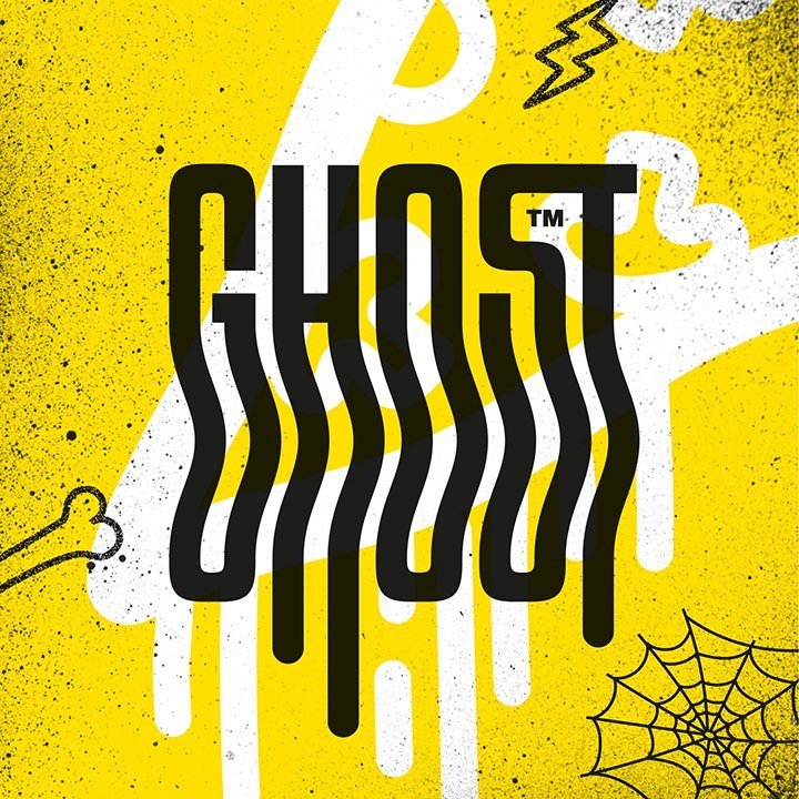
Clear space — keep the drips free
On ink
On yellow
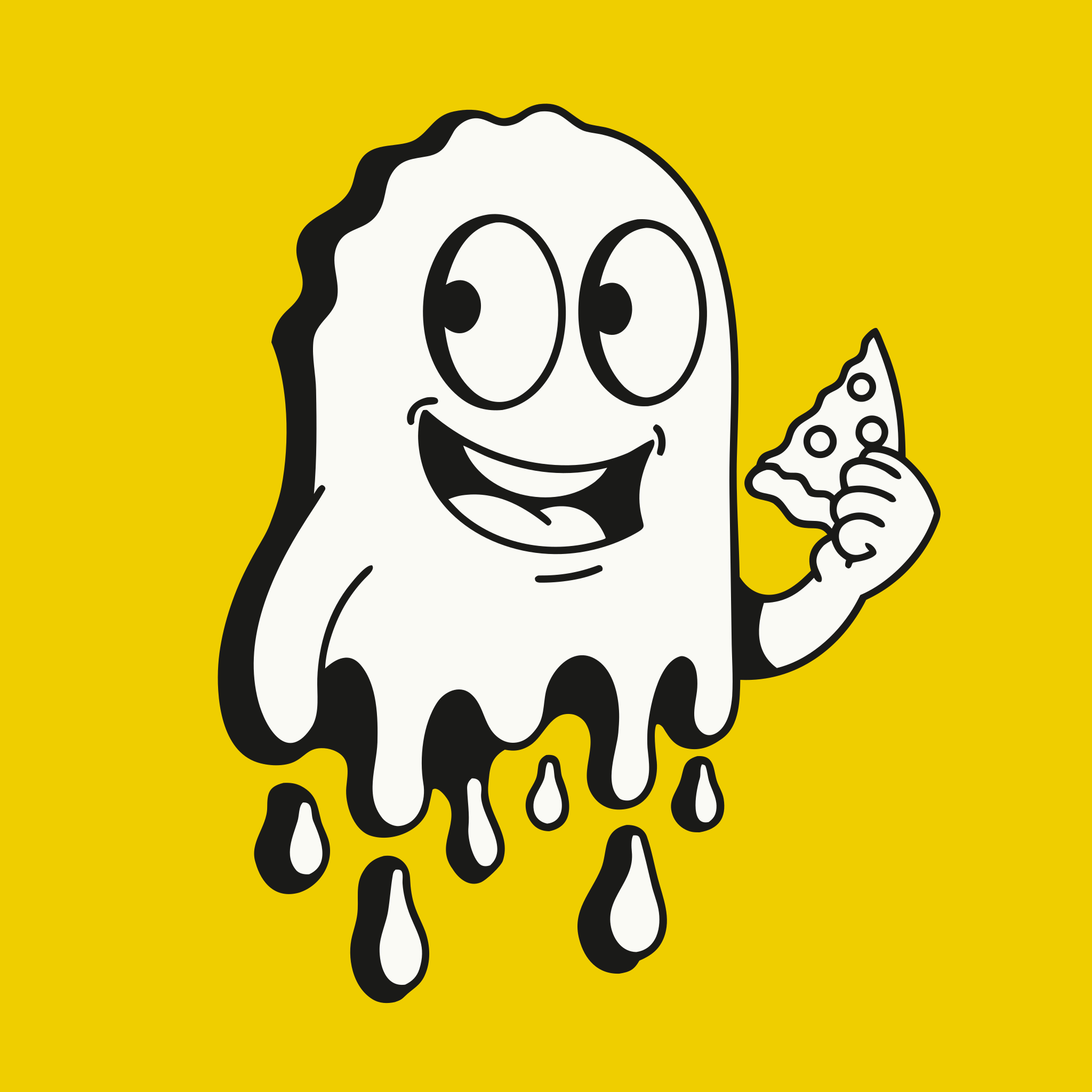
Mascot — “Drippy”
The dripping ghost is our secondary mark and sticker hero. Use it big, use it everywhere, let it leak off the edge.
02 — Color
THE PALETTE
One scream of yellow, one slab of black, one ghost of white. Two accents — blood & slime — are used sparingly for heat and freshness. That’s the whole ghost.
03 — Typography
THE TYPE
A three-voice system: a brutal display, a workhorse body and a utility mono. Headlines shout, body keeps it readable, mono handles prices, tags and the small print.
04 — Illustration
INK & DRIP
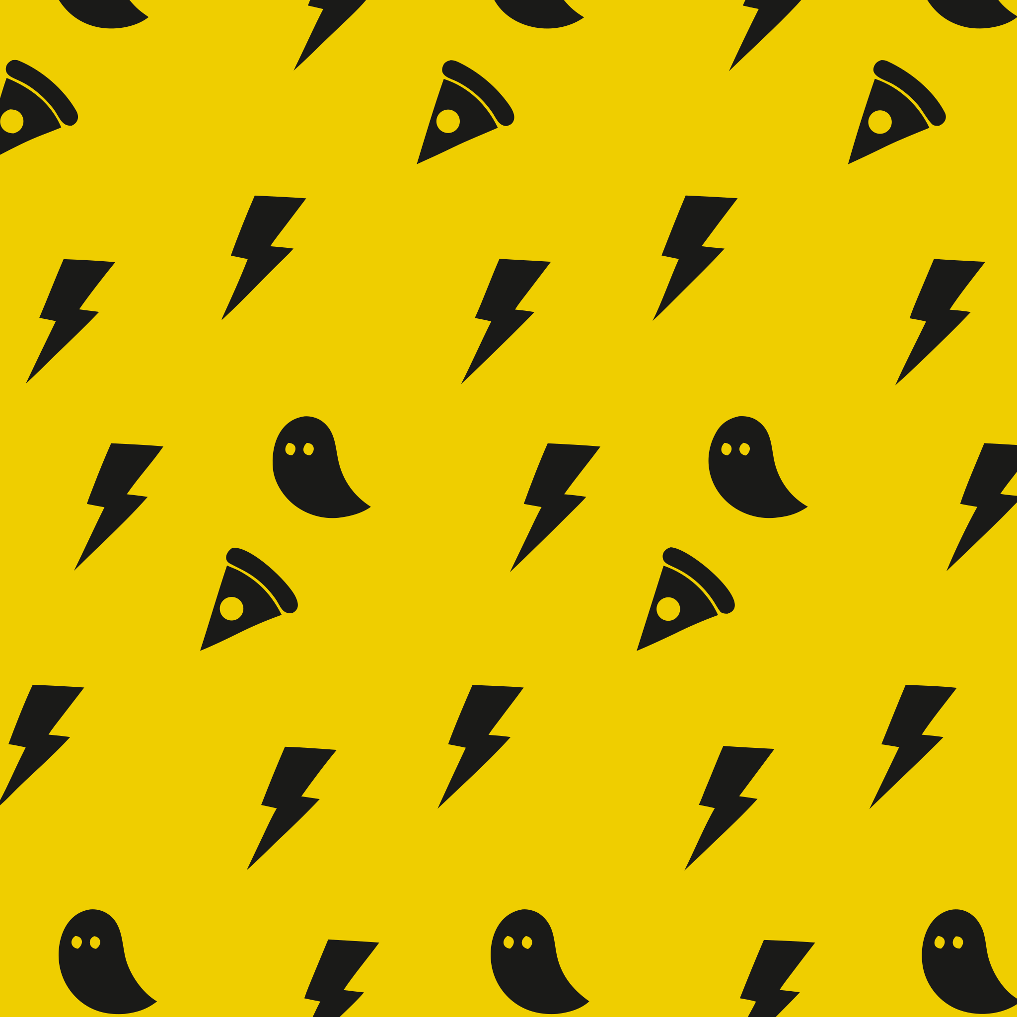
Our graphic language is street-art screen-print: thick black outlines, dripping paint, hand-scrawled marquees and a tossable icon set — ghosts, slices and lightning bolts at a 15° tilt.
05 — Art Direction
SHOOT IT
HOT
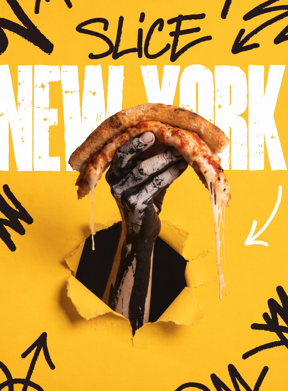
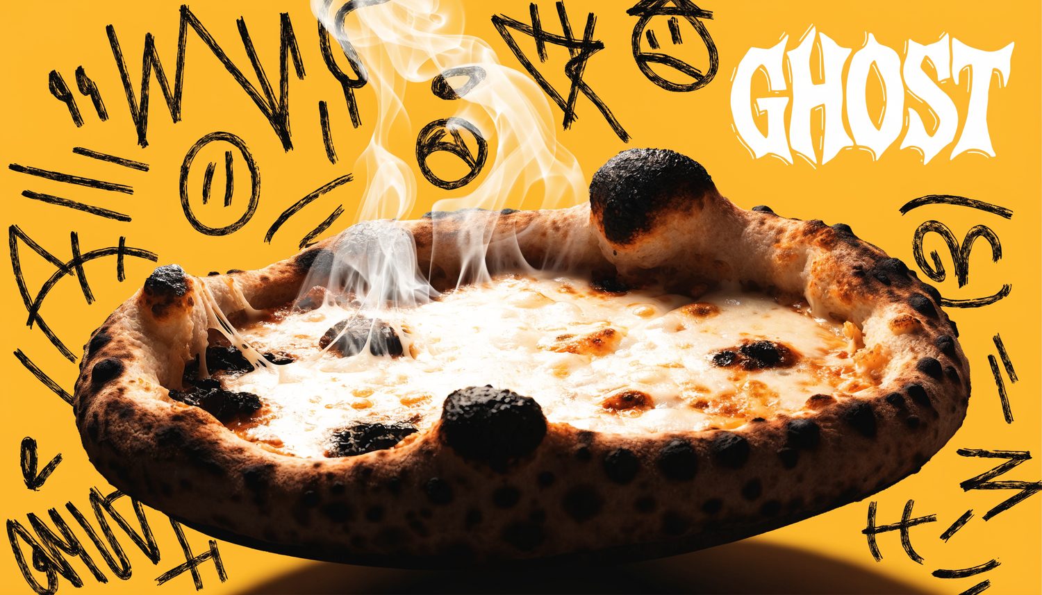
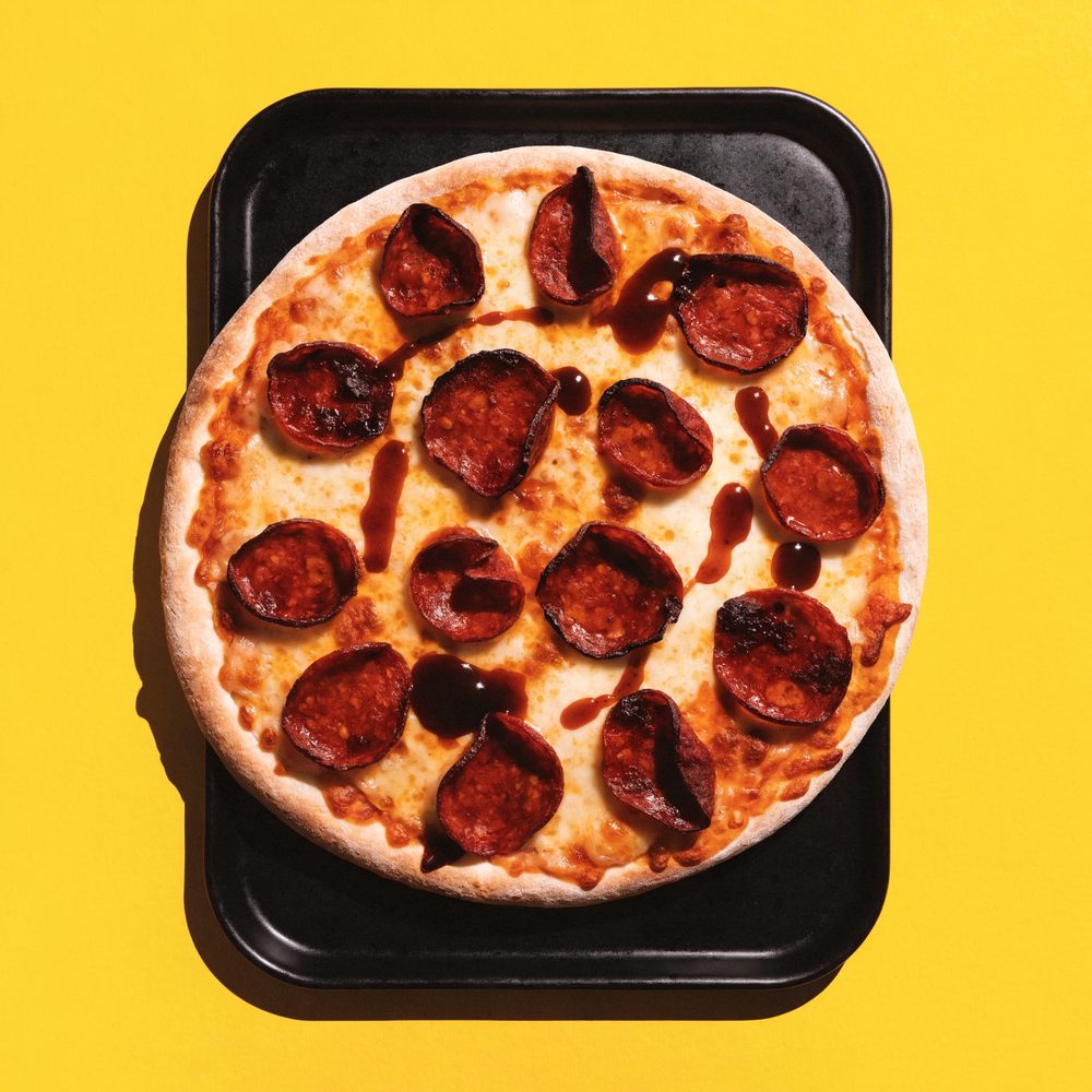
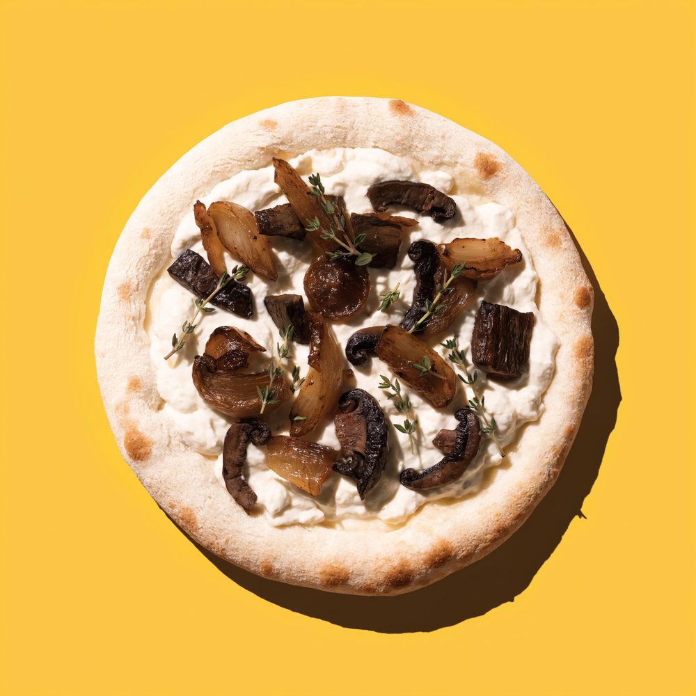
Food is shot on a seamless acid-yellow sweep with hard, single-source light and deep shadows. Char, smoke and cheese-pull are the heroes. Keep it high-contrast, appetizing and a little dangerous — like a street poster you can eat.
06 — Voice
HOW WE TALK
Short, punchy, a little spooky. We name pizzas like horror characters and write like a confident friend who’s up too late. Norwegian or English — always cheeky, never corny.
✓ We say
- “Pizza that haunts Oslo.”
- “Order a will before you order The Reaper.”
- “Open ’til the witching hour.”
- “No tricks. All treats.”
✗ We don’t
- Corporate filler (“delicious artisanal experience”).
- Overusing horror clichés until it’s cringe.
- Long paragraphs. Get to the slice.
- Apologising for being loud.
07 — Contact
SUMMON US
Questions about the brand, partnerships or press? The fire’s always on.
hei@ghostpizza.no